









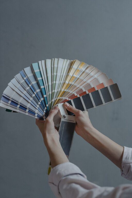
Creating a calm and inviting environment in your home starts with choosing the right colors. Colors have a powerful effect on our mood and can either energize or soothe us. If you want a space that feels peaceful and relaxing, opting for calm colors is a smart approach. This guide will help you understand how to select the best calm colors for your home and make your living space a tranquil retreat.
Why Choose Calm Colors?
Calm colors are tones that evoke a sense of peace and relaxation. Often, these include softer hues like pastels, muted shades, and neutrals. Unlike bright or intense colors, calm colors reduce stress and help create a balanced atmosphere. Whether you want a bedroom that promotes restful sleep or a living room that encourages unwinding after a long day, calm colors can work wonders.
Understanding Color Psychology
Before diving into specific colors, it helps to understand how different colors influence emotions:
– Blue: Often associated with tranquility and stability, blue is a popular choice for bedrooms and bathrooms.
– Green: Evokes nature and balance, promoting harmony and calmness.
– Soft Gray: A neutral shade that offers sophistication without overwhelming the senses.
– Beige and Cream: Warm neutrals that create a cozy, inviting atmosphere.
– Lavender and Soft Purple: Gentle colors that encourage relaxation and creativity.
Knowing these associations can guide your choices and help you pick colors that align with the mood you want to create.
Tips for Choosing Calm Colors
1. Consider the Room’s Purpose
Different rooms serve different functions, and your color choices should reflect that. For instance:
– Bedroom: Opt for soothing colors like light blue, soft green, or pale lavender to promote restfulness.
– Living Room: Choose neutral tones or muted pastels to create a welcoming space without overstimulation.
– Home Office: Select calming colors that also encourage focus, such as soft blues or light greens.
– Bathroom: Light neutrals and cool tones can make the space feel fresh and serene.
2. Use a Color Palette
Instead of picking a single color, consider creating a palette with complementary calm shades. A well-balanced palette enhances cohesion and depth in your design. For example, you might combine a pale blue wall with cream-colored furniture and soft gray accents.
3. Test Samples in Different Lighting
Colors can look very different depending on the time of day and lighting conditions. Paint small swatches on your walls and observe them in natural sunlight, artificial light, and in the evening. This helps you avoid surprises and ensures the calm color you pick truly fits your space.
4. Balance with Neutrals
Even when choosing calm colors, balancing them with neutral tones helps ground the space and prevents it from feeling too monotonous. Whites, beiges, or light grays work well as complements and can brighten the room while maintaining tranquility.
5. Avoid Overly Dark or Saturated Colors
Dark or highly saturated colors can feel heavy or overwhelming, which may counteract the calming effect you desire. If you prefer richer tones, consider using them as accent colors instead of the main wall color.
6. Incorporate Natural Elements
Pair calm colors with natural textures and materials, such as wood, stone, or plants. These elements enhance the serene feeling and connect your space to the outdoors, which is known to promote relaxation.
Popular Calm Color Choices
Here are some popular calm colors you might consider:
| Color Name | Description | Best For |
|——————|———————————————-|——————-|
| Soft Blue | Light and airy, inspires calm and clarity | Bedrooms, bathrooms|
| Sage Green | Muted green with gray undertones | Living rooms, kitchens|
| Pale Lavender | Delicate and soothing | Bedrooms, offices |
| Warm Beige | Cozy and inviting | Living rooms, hallways|
| Light Gray | Modern and neutral, blends well with accents | Almost any room |
Practical Tips for Applying Calm Colors
– Start Small: If you’re hesitant, begin with small areas like accent walls or furniture pieces.
– Add Textiles: Use curtains, pillows, and rugs in calm colors to introduce softness without commitment.
– Consider Matte Finishes: Matte or eggshell paints often give a softer look than glossy finishes, enhancing the calming effect.
– Use Consistency: Try to keep a consistent color scheme throughout connected spaces to maintain a smooth flow and peaceful vibe.
Final Thoughts
Choosing calm colors for your home is an effective way to create a soothing sanctuary where you can relax and recharge. By understanding how colors affect mood and following practical steps, you can select hues that perfectly suit your style and needs. Remember to take your time, test samples, and incorporate natural elements to bring your calming vision to life.
Enjoy transforming your home into a peaceful haven with the power of calm colors!